PennyPal: Rethinking Budgeting for Students
Making personal finance simple, intuitive, and actually usable for college life
Timeline: 2 months
My Role: UX Research · Interface Design
Team: 4 members
Challenge
College students juggle a lot with very little financial cushion. We met students who were stressed, uncertain, and overwhelmed by budgeting. Most tools out there made them feel worse.
PennyPal was our attempt to shift that. The goal? Build something flexible, smart, and reassuring that would help students not just track spending, but feel okay doing it.
Solution
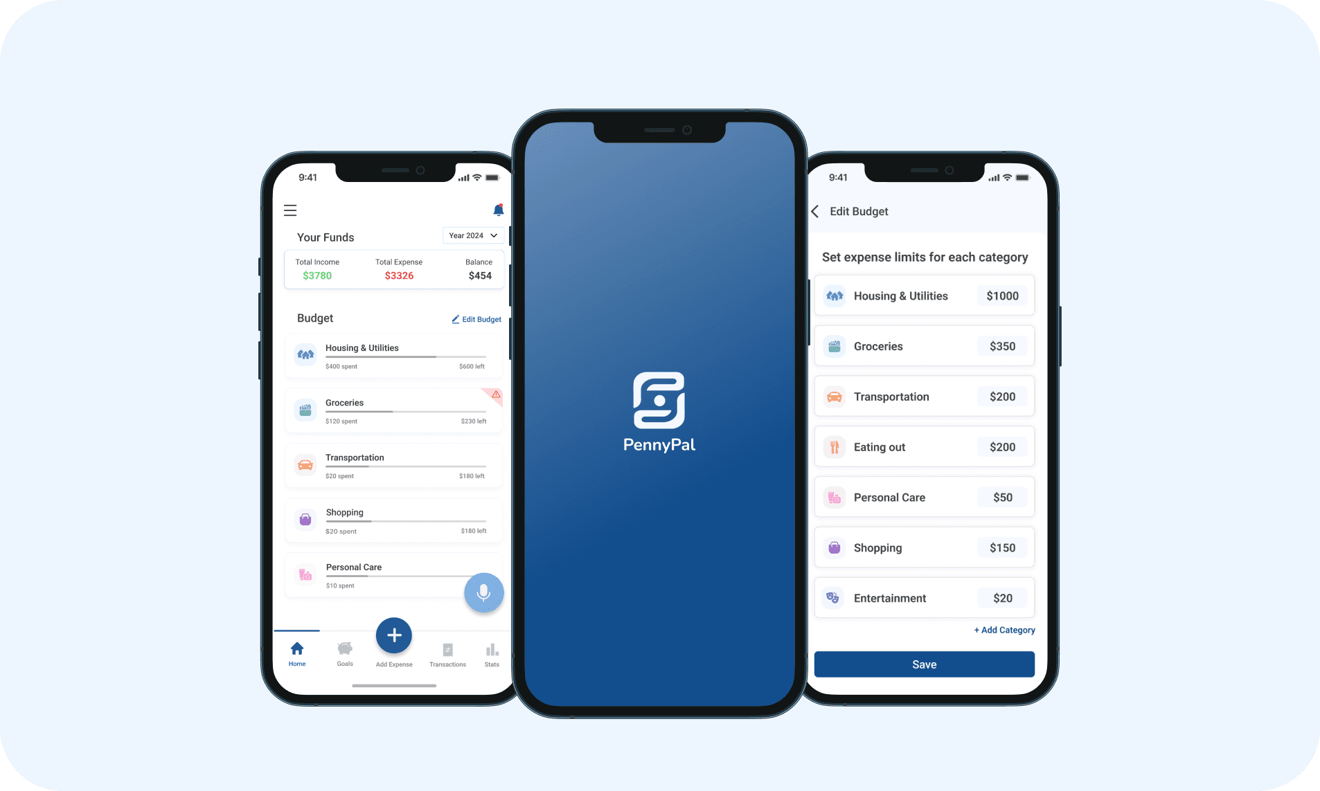
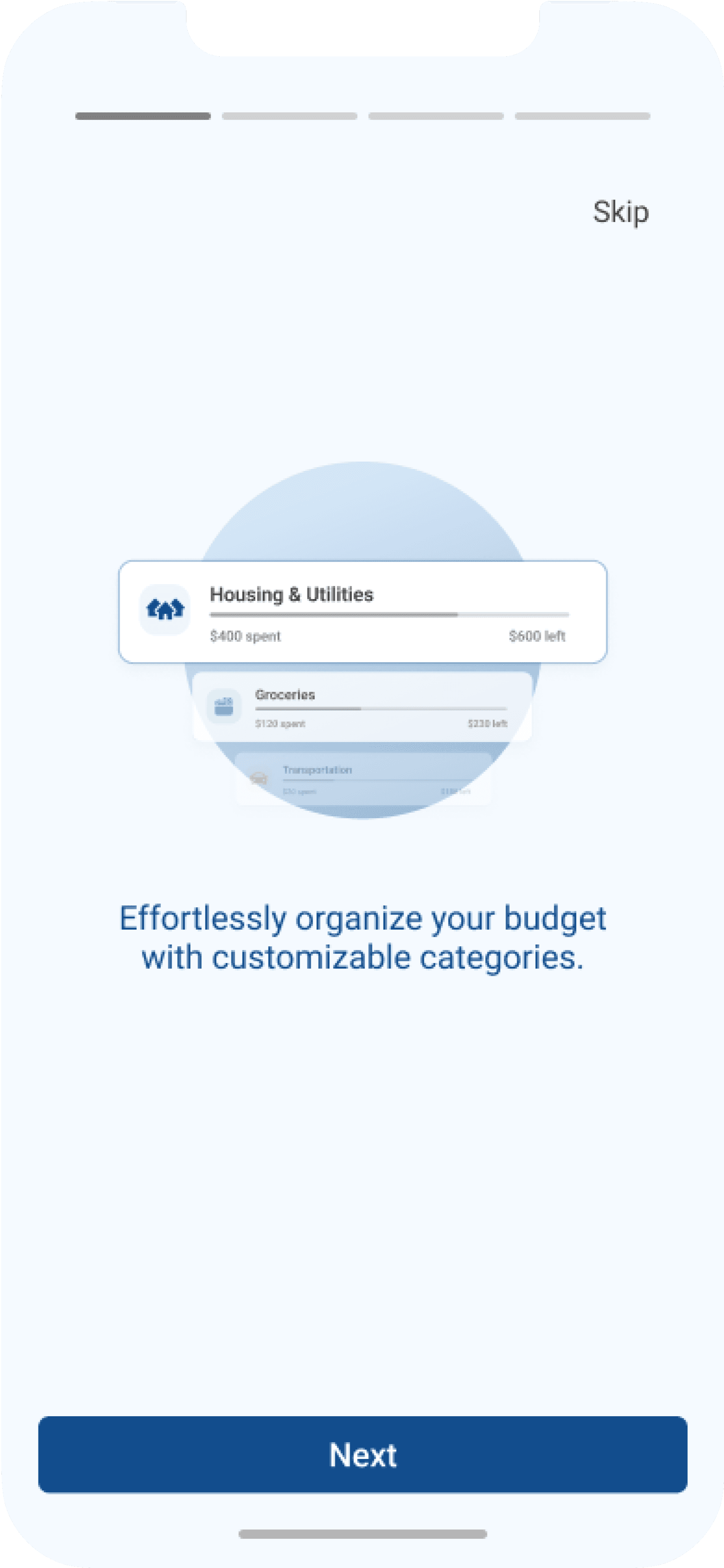
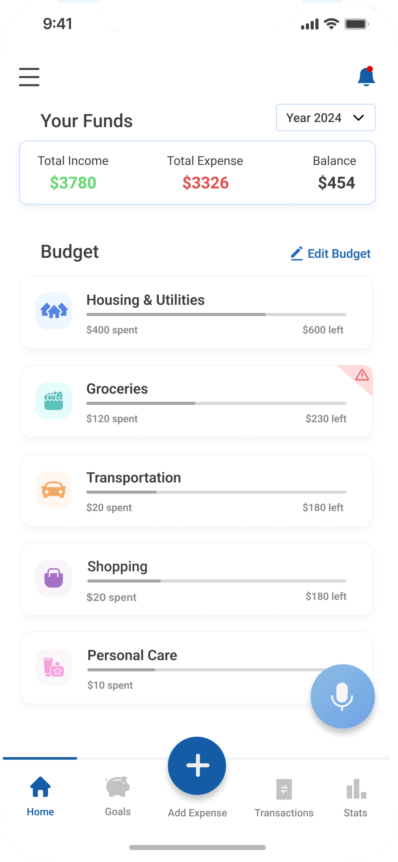
Housing & Utilities
$600 left
$400 spent
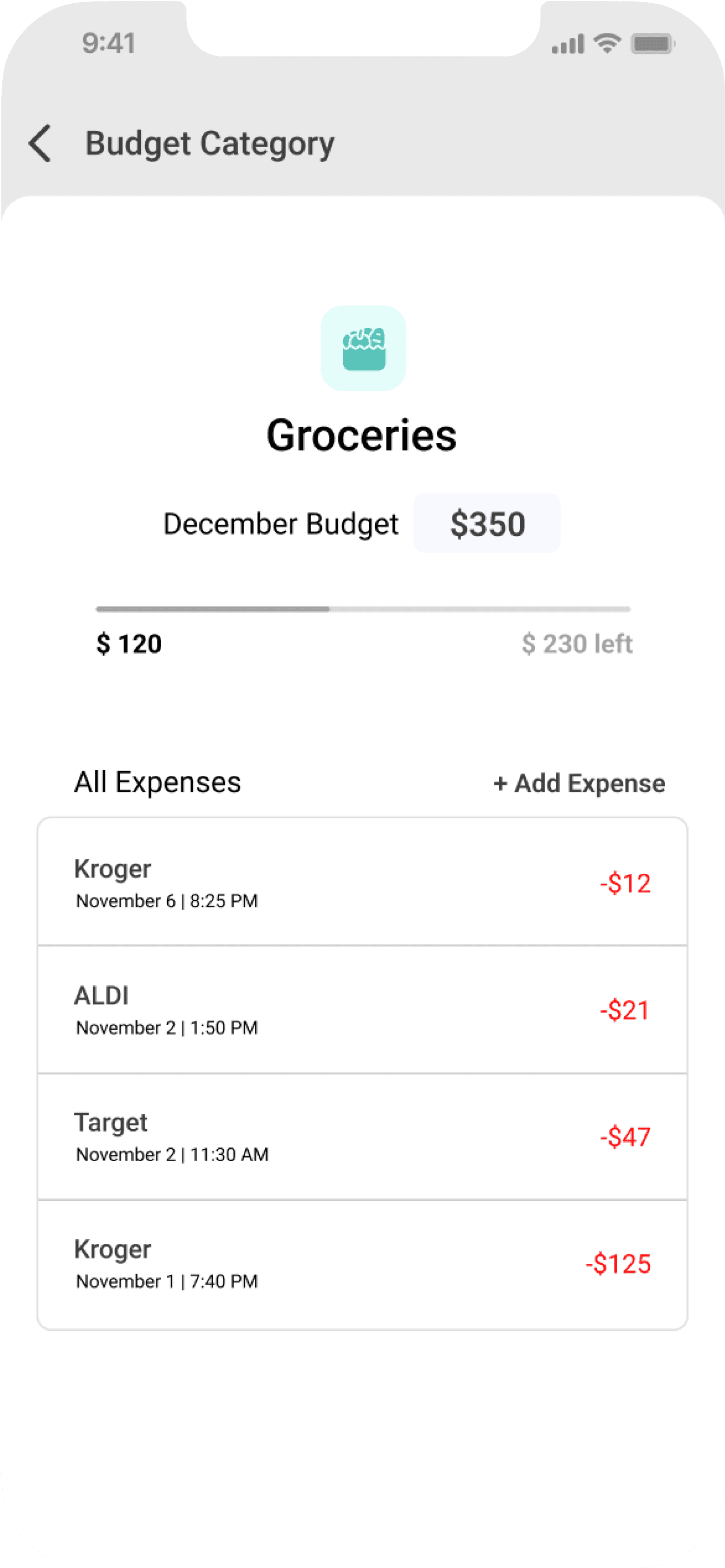
Groceries
$230 left
$120 spent
Transportation
$180 left
$20 spent
Shopping
$180 left
$20 spent
Personal Care
$10 spent
01
A dashboard that brings clarity
Users can see where their money was going, without hunting for it

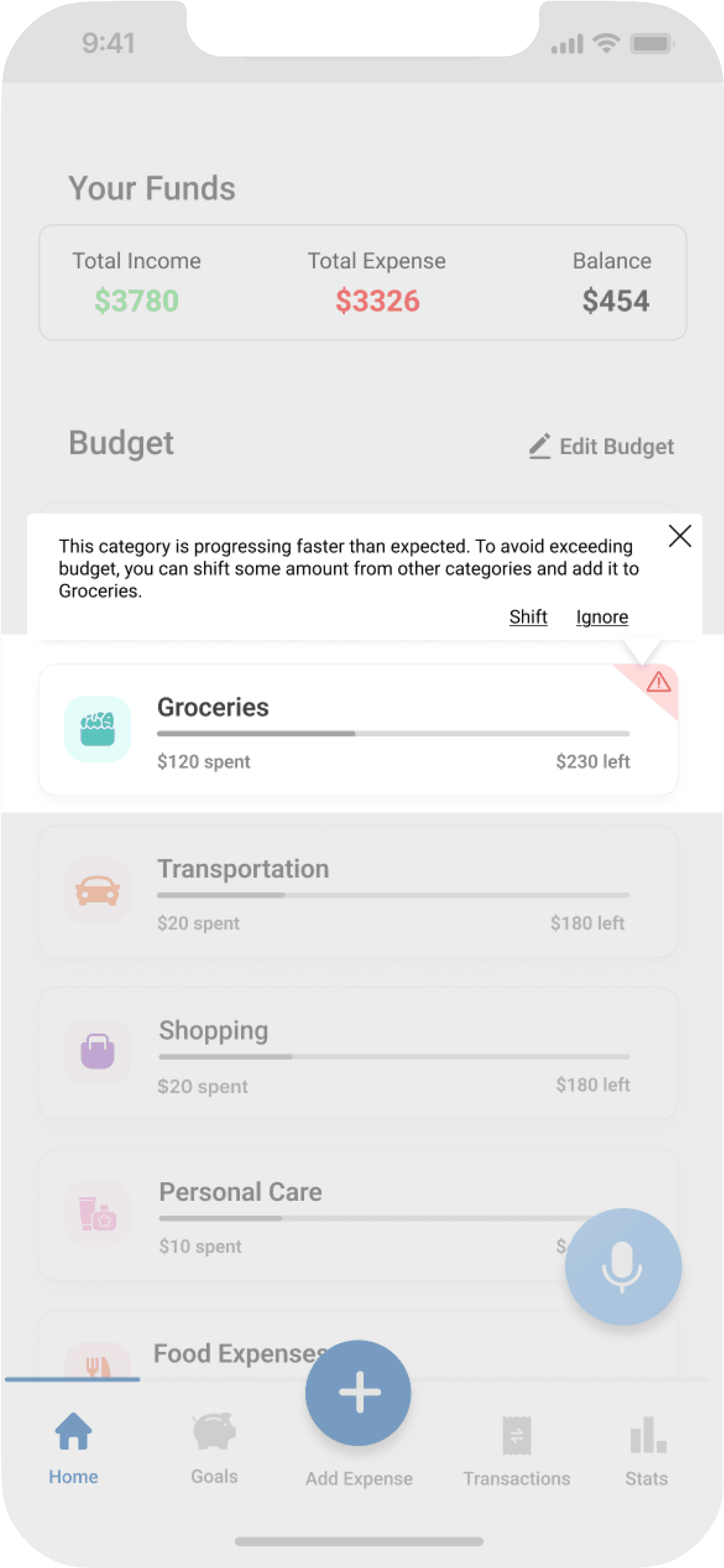
This category is progressing faster than expected. To avoid exceeding budget, you can shift some amount from other categories and add it to Groceries.
Shift
Ignore
Groceries
$230 left
$120 spent
02
Smart nudges that feel supportive
Gentle prompts to readjust budget when a category is spending rapidly
03
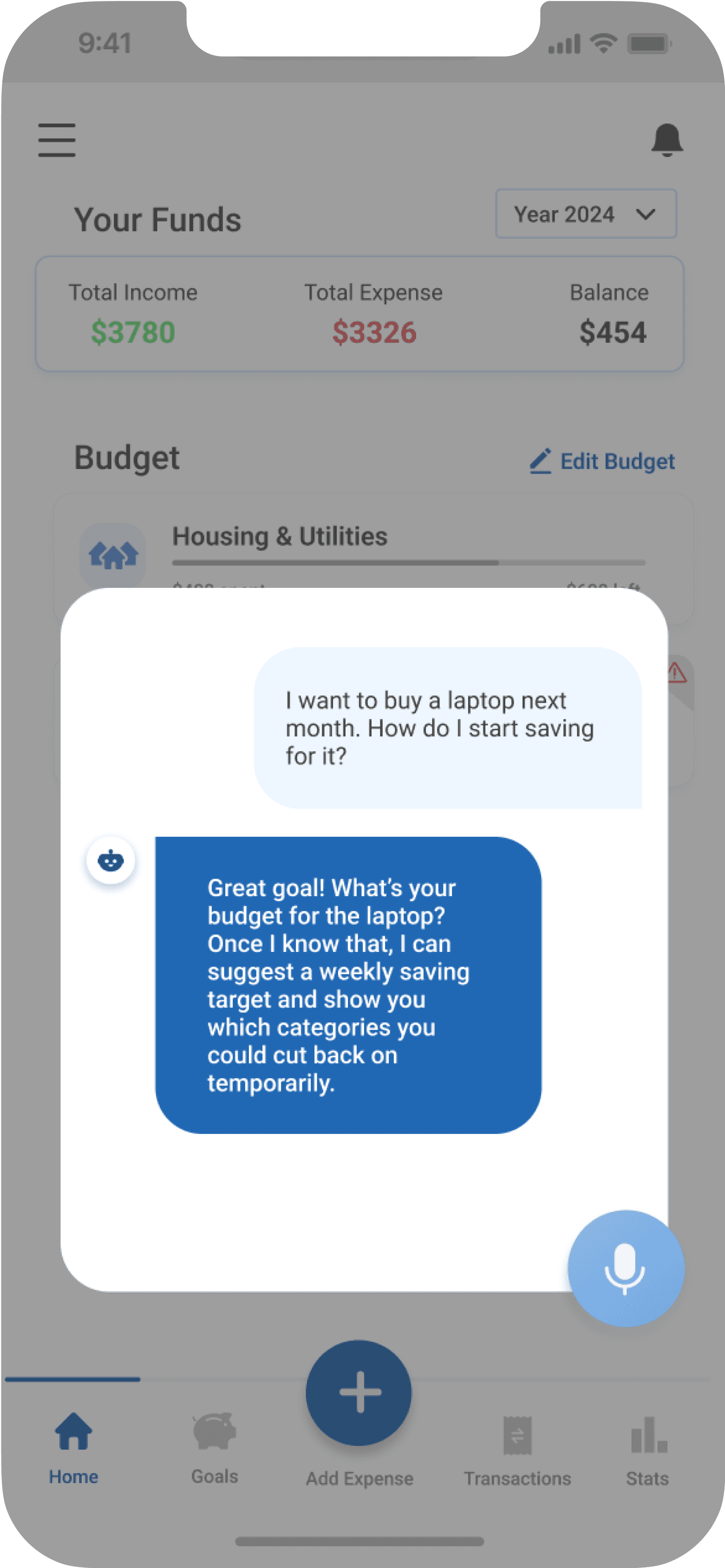
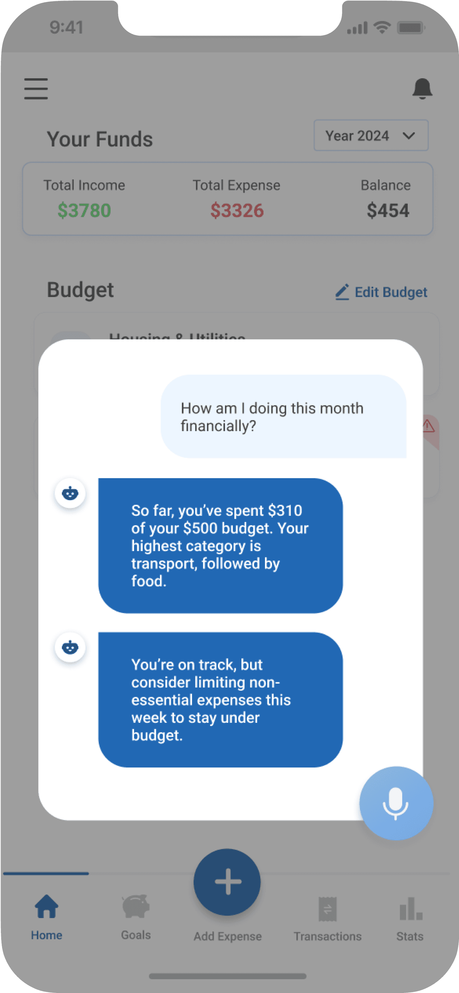
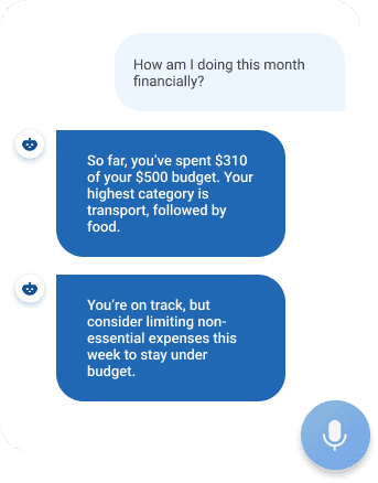
An AI assistant that makes life easier
Helps record transactions, learns from spending habits, and offers tips
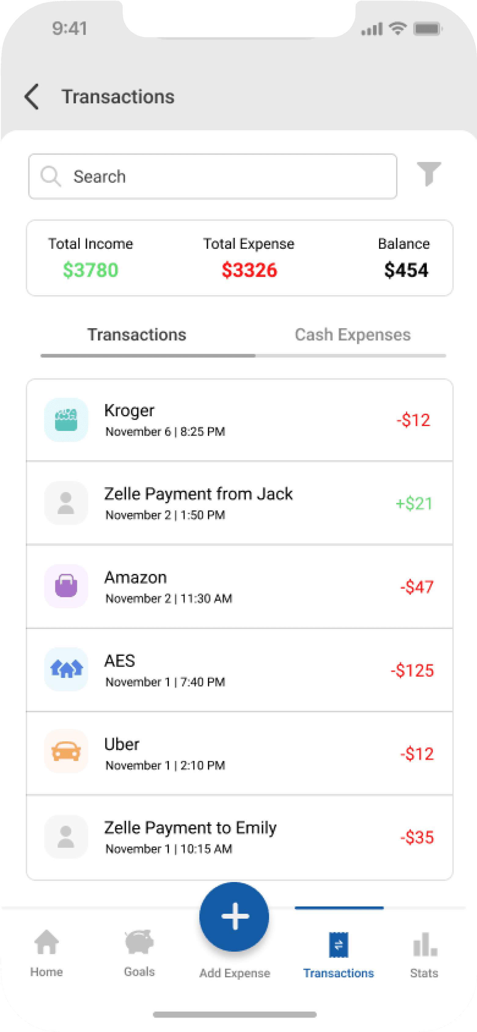
Uber
November 1 | 2:10 PM
-$12
AES
November 1 | 7:40 PM
-$125
Amazon
November 2 | 11:30 AM
-$47
Kroger
November 6 | 8:25 PM
-$12
Zelle Payment from Jack
November 2 | 1:50 PM
+$21
Zelle Payment to Emily
November 1 | 10:15 AM
-$35
04
Auto categorization that saves time
Gentle prompts to readjust budget when a category is spending rapidly
How did we get there?
It all starts by talking to the users...
We interviewed 20 students, undergrad, grad, PhD, over two weeks. We wanted to hear it straight from them: what was hard about money, what they currently do (or don’t), and what would help.
What came up again and again?
→
Manual tracking led to missing or incorrect data
→
Surprise expenses often broke their systems
→
No app really felt like it was built for them
→
Financial stress is a daily undercurrent
Who we were designing for
Not every student was the same, but a few core behaviors stood out. One key persona we built around:
Mapping the budgeting journey
We mapped out a typical student’s current budgeting flow and analyzed where uncertainty shows up, where friction exists, and where design could help users feel a little more in control.
How might we
Reduce the friction of expense tracking for students while supporting flexible, adaptable budgeting?
Shaping the right features
We ran an open-ended ideation session rooted in the findings. Using mind mapping, we explored every pain point and generated feature ideas around them.
Testing the initial concept


We tested our low-fidelity prototype with 8 students from varied backgrounds and received crucial feedback that helped us refine the design.
→
Many pointed out that the home screen lacked clarity. They wanted a more detailed breakdown of their budget without having to dig through multiple screens.
→
The alert system we introduced to flag overspending was well-liked. A few even mentioned it’d help them pause and rethink non-essential purchases.
→
Students also responded positively to auto-categorization of expenses through bank linking, though a few emphasized the need to easily correct or rename categories when the system got it wrong.
→
A recurring theme was the desire for some kind of financial guidance. This was our push to explore voice assistance that could answer quick questions or help log expenses without typing.
Final design
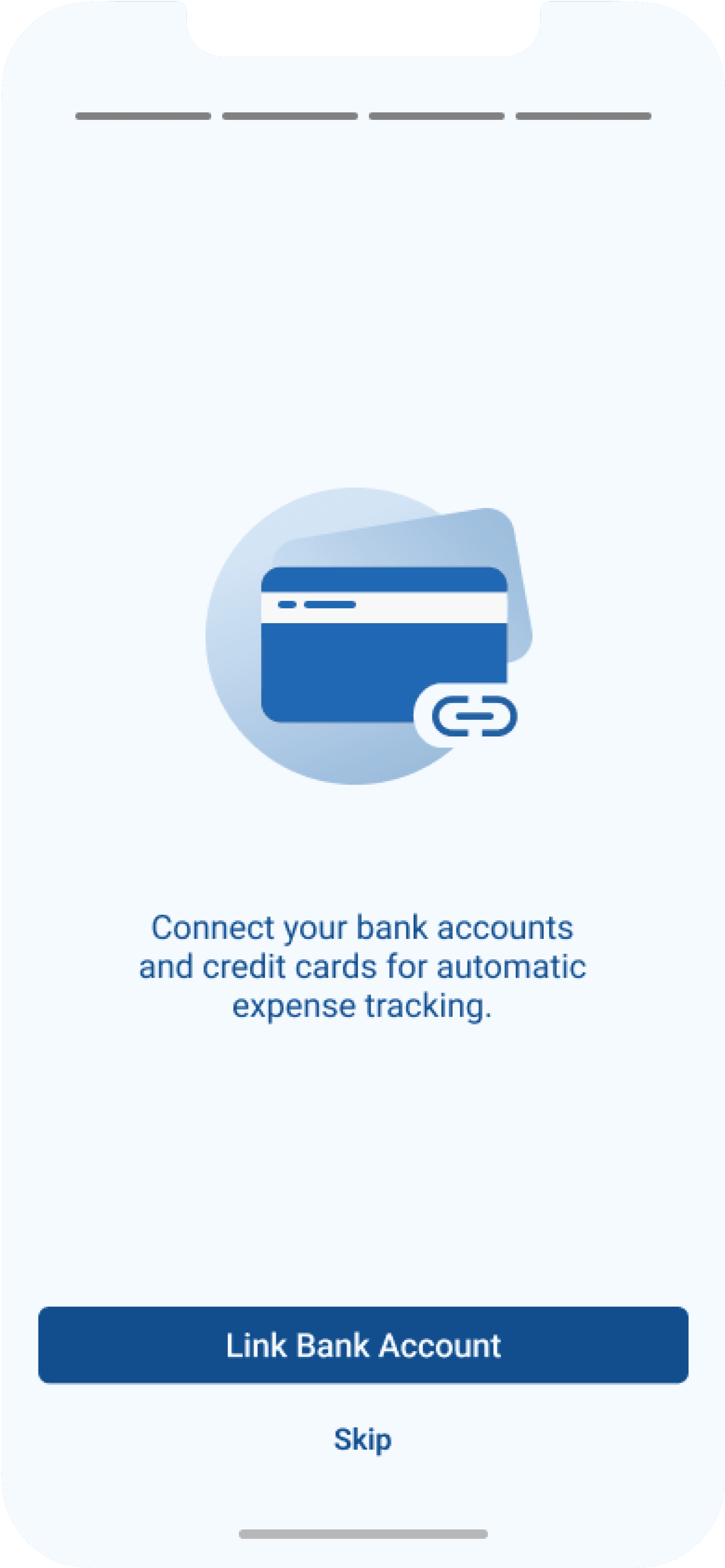
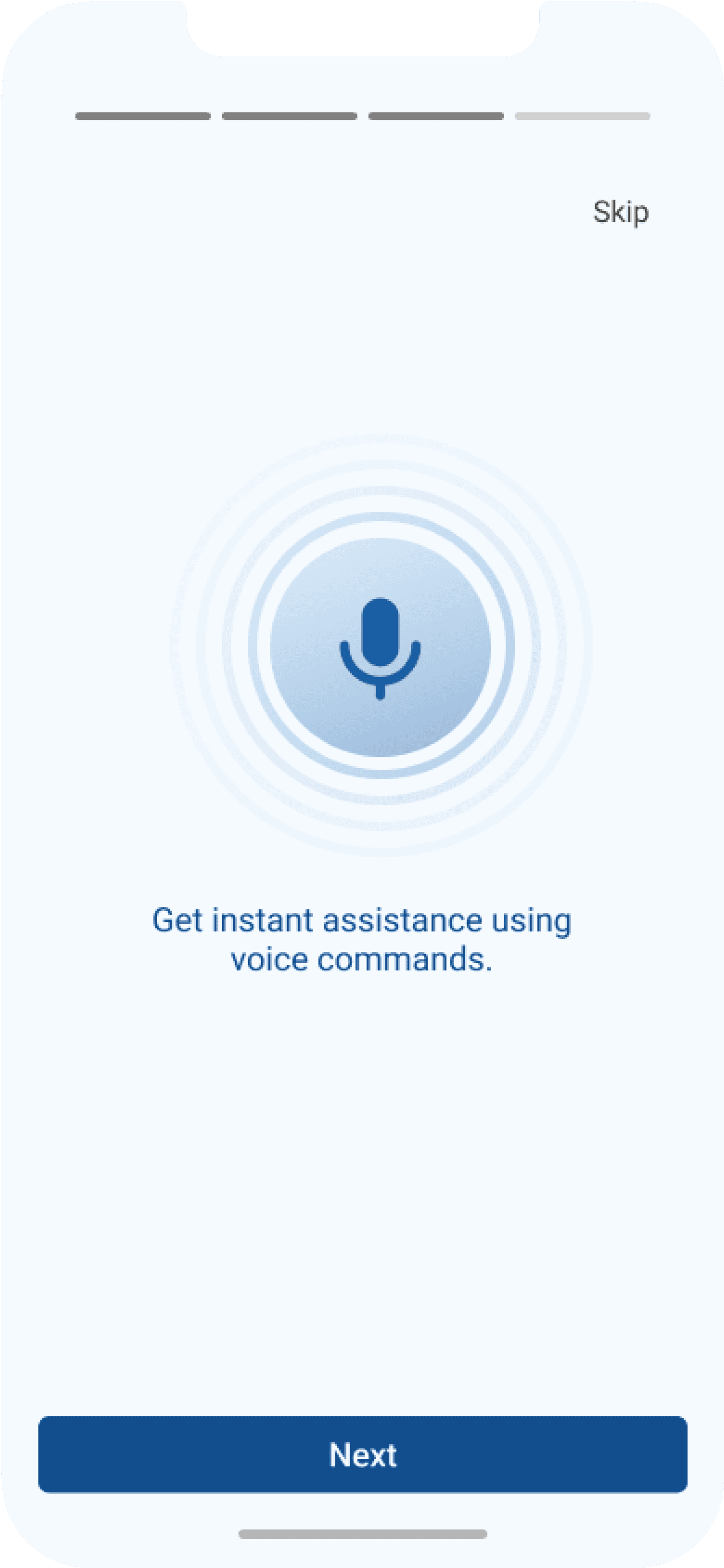
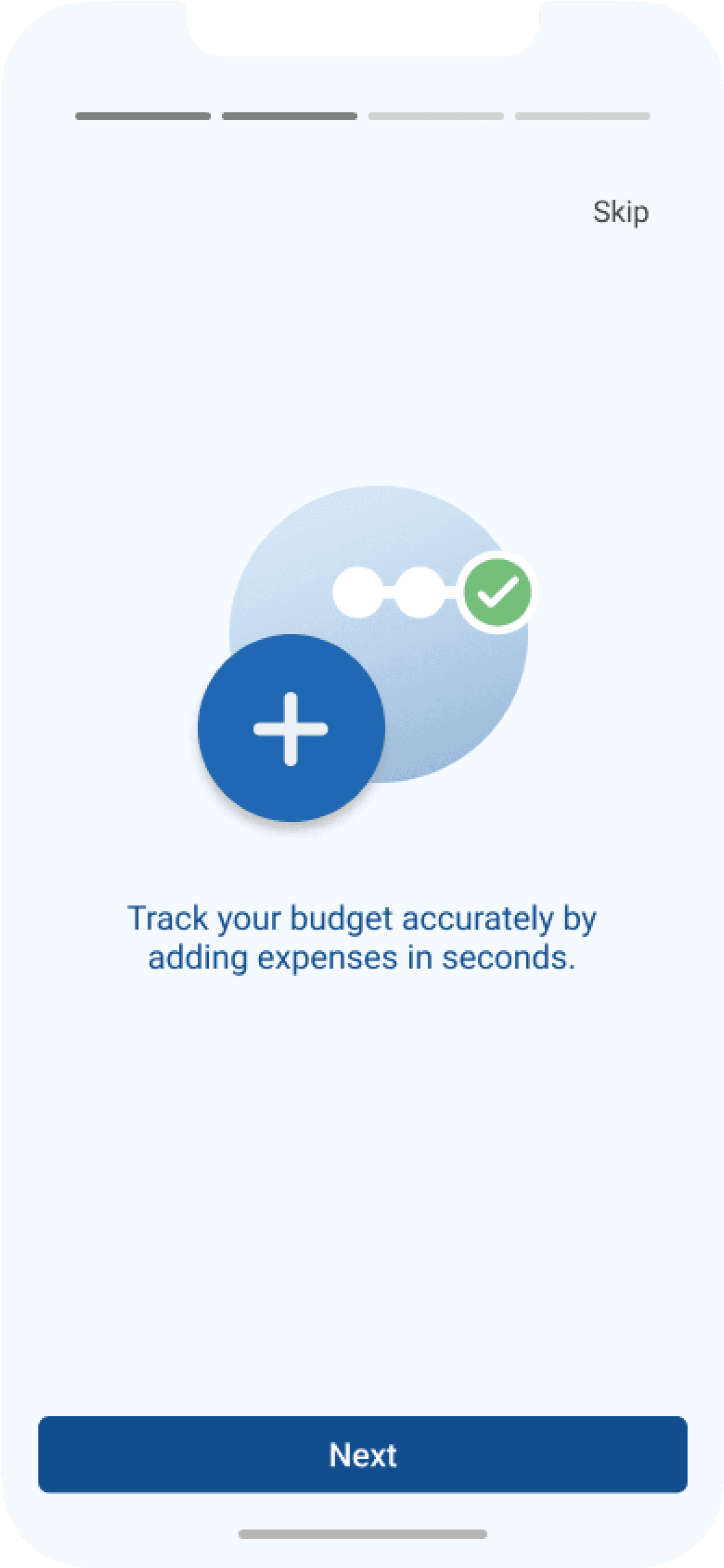
Onboarding
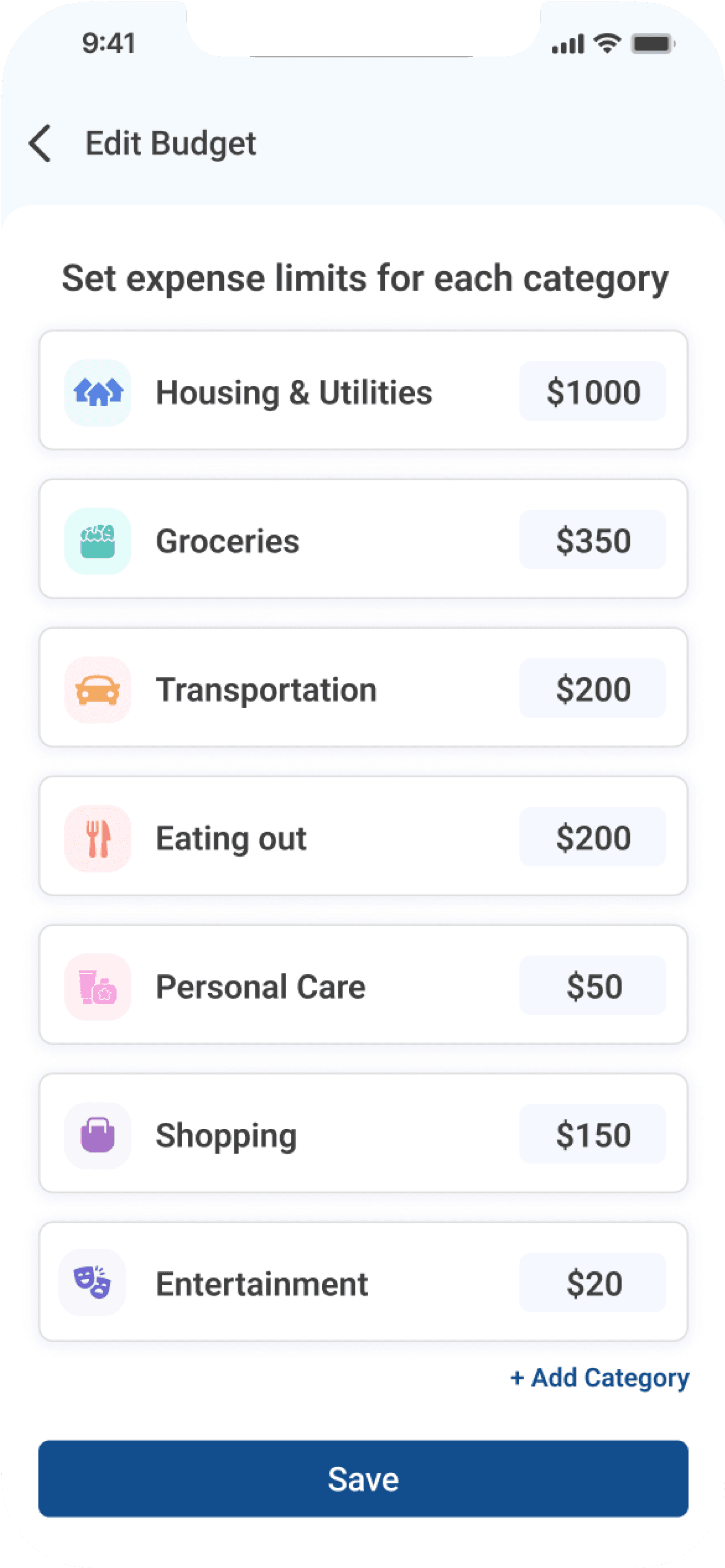
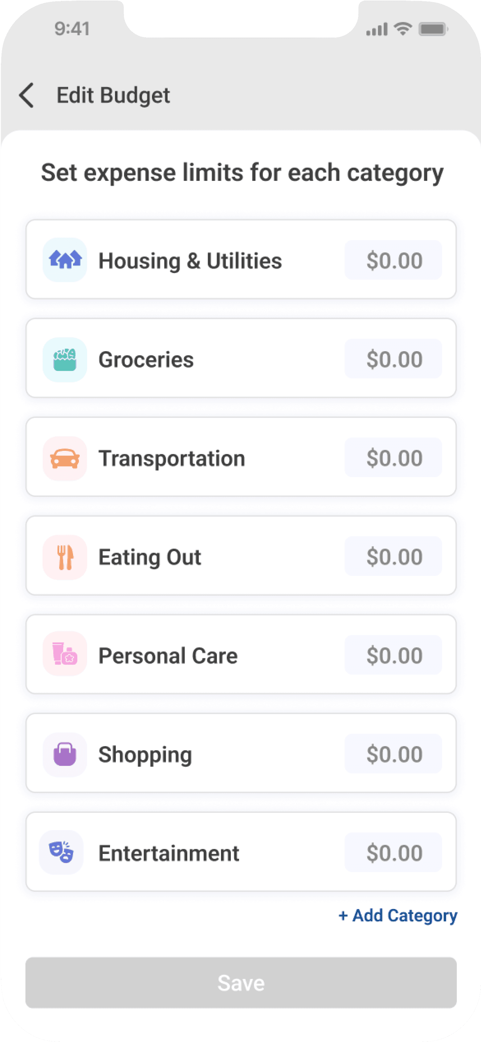
Budget setting and tracking
Transaction logs
AI assistance
Observed impact
We tested the final prototype with 10 students through moderated usability sessions. Each participant was asked to complete key tasks, like setting up a monthly budget, reviewing expenses, and interacting with the AI assistant. We followed this with short interviews and a questionnaire that measured satisfaction, clarity, and ease of use on a 5-point scale. This helped us capture both observed behavior and self-reported feedback to understand the overall usability of the design.
Budgeting confidence
+46% boost
2.8/5
Before PennyPal
4.1/5
After PennyPal
Financial stress
High
Before PennyPal
Low
After PennyPal
User satisfaction
+44% increase
3.2/5
Before PennyPal
4.6/5
After PennyPal
Users liked…
→
Faster expense logging through quick-access features.
→
Reduced financial stress by enabling budget adaptability.
→
Simplified navigation through a clear and intuitive UI.
What I learned
Talking to users showed me that budgeting isn't just about numbers. It's about the emotional weight behind those numbers.
The research process reminded me that good questions matter just as much as good solutions. It also reinforced the need to let go of assumptions and follow what real feedback reveals.
