Lost in the Library

A UX research journey to improve digital wayfinding

Timeline: 6 Weeks

My Role: UX Research

Client: IU Library

Challenge

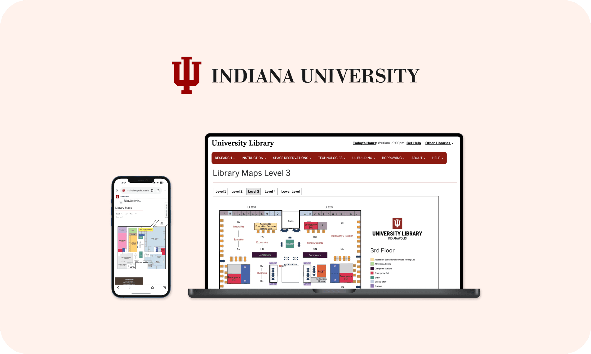
The library map system was supposed to help users get around the building. But after talking to students and staff, it became clear that the current system was not working. People kept asking the help desk for directions. Many relied on memory, hallway signs, or just trial-and-error.

This wasn’t just a minor inconvenience. It impacted how easily someone could access services, attend events, or explore lesser-known parts of the library.

Goal

This project aimed to systematically evaluate the usability challenges and provide evidence-based recommendations for improvement.

What we set out to learn

The research began with defining clear objectives: to evaluate how well users could navigate the space using the digital maps, and to pinpoint moments where the experience broke down.

Can users find a specific room or service point without asking for help?
Does the digital map make sense when you’re standing inside the building?
Where do people hesitate, get confused, or lose their sense of direction?

How we designed the test

We recruited 10 participants (mix of undergrad and grad students) who were either new to the building or had limited prior experience with the map. Our goal was to see how they'd actually use the system if they walked in without guidance.

5 Graduate students
5 Undergraduates

We used task-based testing with think-aloud protocol, where participants talked through their thoughts as they tried to:

Find specific rooms or services

Navigate from one spot to another

Interpret color-codes and signage

This helped us catch moments of confusion, hesitation, and workarounds in real time.

After the tasks, we gathered feedback through:

System Usability Scale (SUS) questionnaire to get a quick sense of perceived usability

Short follow-up interviews to dig into what they liked, what didn’t work, and what they’d change

The shocking results

The Library Map website received an average SUS score of 58.5, which falls significantly below the benchmark of 70, pointing to poor usability.

Statistical analysis revealed a 97.89% probability that the true usability score is below 70, providing strong evidence of usability issues.

0

0

0

10

10

10

20

20

20

30

30

30

40

40

40

50

50

50

60

60

60

70

70

70

80

80

80

90

90

90

100

100

100

Needs serious improvement

Needs serious improvement

Needs serious improvement

Needs improvement

Needs improvement

Needs improvement

Good

Good

Good

Excellent

Excellent

Excellent

58.5

58.5

58.5

Acceptability scale

Acceptability scale

Acceptability scale

SUS Score

SUS Score

SUS Score

What went wrong?

Discoverability

6 out of 10

couldn’t even locate the map on the website

Discoverability

6 out of 10

couldn’t even locate the map on the website

Discoverability

6 out of 10

couldn’t even locate the map on the website

Mobile Friction

8 out of 10

struggled with the mobile experience

Mobile Friction

8 out of 10

struggled with the mobile experience

Mobile Friction

8 out of 10

struggled with the mobile experience

Visual Overload

7 out of 10

found the design too dense and confusing

Visual Overload

7 out of 10

found the design too dense and confusing

Visual Overload

7 out of 10

found the design too dense and confusing

Users couldn’t tell which way they were facing. The map didn’t help them match digital direction to real-world movement.
Switching floors or zooming made people lose track of where they were. It interrupted the flow of navigation.
Poor visual hierarchy and confusing color codes made the map hard to interpret.

What needs to change

Based on SUS ratings and user interviews, the following key changes are needed to improve clarity, usability, and how quickly users can interpret the map.

Make it visible

Move map to main navigation and add prominent visual cues so users can actually find it.

Make it visible

Move map to main navigation and add prominent visual cues so users can actually find it.

Make it visible

Move map to main navigation and add prominent visual cues so users can actually find it.

Smart search integration

Add search functionality within the map. Auto-suggest popular locations as users type.

Smart search integration

Add search functionality within the map. Auto-suggest popular locations as users type.

Smart search integration

Add search functionality within the map. Auto-suggest popular locations as users type.

Simplify design

Reduce visual clutter and improve information hierarchy for clearer navigation.

Simplify design

Reduce visual clutter and improve information hierarchy for clearer navigation.

Simplify design

Reduce visual clutter and improve information hierarchy for clearer navigation.

Visual improvements

Use color-coding by floor with consistent legend and add visual breadcrumbs showing current location.

Visual improvements

Use color-coding by floor with consistent legend and add visual breadcrumbs showing current location.

Visual improvements

Use color-coding by floor with consistent legend and add visual breadcrumbs showing current location.

Interactive hotspots

Show real-time availability for study rooms and include clickable targets with pop-up details.

Interactive hotspots

Show real-time availability for study rooms and include clickable targets with pop-up details.

Interactive hotspots

Show real-time availability for study rooms and include clickable targets with pop-up details.

Why this matters

Student gains

Saves time. Can quickly locate key spots like study rooms, printers, or restrooms without asking.

Less cognitive load. Easier-to-interpret maps mean more mental energy for actual tasks.

Feel more confident navigating the building independently.

Library gains

Staff benefits. Fewer interruptions from lost or confused students asking for directions.

Better utilization. Resources discovered and used more effectively.

Leads to fewer complaints and a more welcoming environment.

What I learned

I realized users weren’t just confused, they felt lost and frustrated. It showed me how bad UX can really damage trust, especially in places that blend physical and digital experiences, like a library.

On mobile, people expect faster responses, easier gestures, and cleaner visuals. That made me realise that designing “mobile-first” has to mean more than just shrinking layouts.

Additionally, using the SUS score helped me validate what users were feeling. It turned subjective pain points into data-backed arguments for change.

Want to talk design, research, or fun side projects?

© 2025 Tanvi Sanandiya

Want to talk design, research, or fun side projects?

© 2025 Tanvi Sanandiya

Want to talk design, research, or fun side projects?

© 2025 Tanvi Sanandiya

Create a free website with Framer, the website builder loved by startups, designers and agencies.